
Designing a Publishing Site? Here’s what you need to know.
For many publishers, design is the most exciting part of their web development project. And as a designer, it’s not uncommon to be greeted during creative briefings with an array of screen grabs and a wish list of fancy features, pop ups and quirky animations.
This kind of enthusiasm we love. But don’t rush into mood boarding your latest website creation just yet. Take the time to reflect on your true business needs and establish how your website design can deliver the most powerful results.
6 Important Factors to Consider When Designing a Digital Publishing Site
This article explores the six factors you should consider when designing a digital publishing site.
1. Do your brand guidelines work for your website?
Building or replatforming a new publishing site is the perfect opportunity to revisit and refresh your brand guidelines. Your website is the primary showcase of your editorial brand. So before you launch a new site to the world, ensure your existing brand guidelines reflect your desired personality and the audience you want to attract.
- Has your audience changed since the brand was first created?
- Do any of your current design elements look dated?
- Is your brand aligned to your future vision and objectives
- Is there sufficient differentiation between you and competitor brands?
Logo
The most common design challenges we encounter on publishing websites involve the logo. A logo that works well on a masthead of a newspaper or branded merchandise might not look so great on your website.
So what kind of logos do work for websites?
Generally speaking, it’s best to stay away from small text and intricate designs. Keep the tagline away from the logo, and make your design bold, clean and simple.
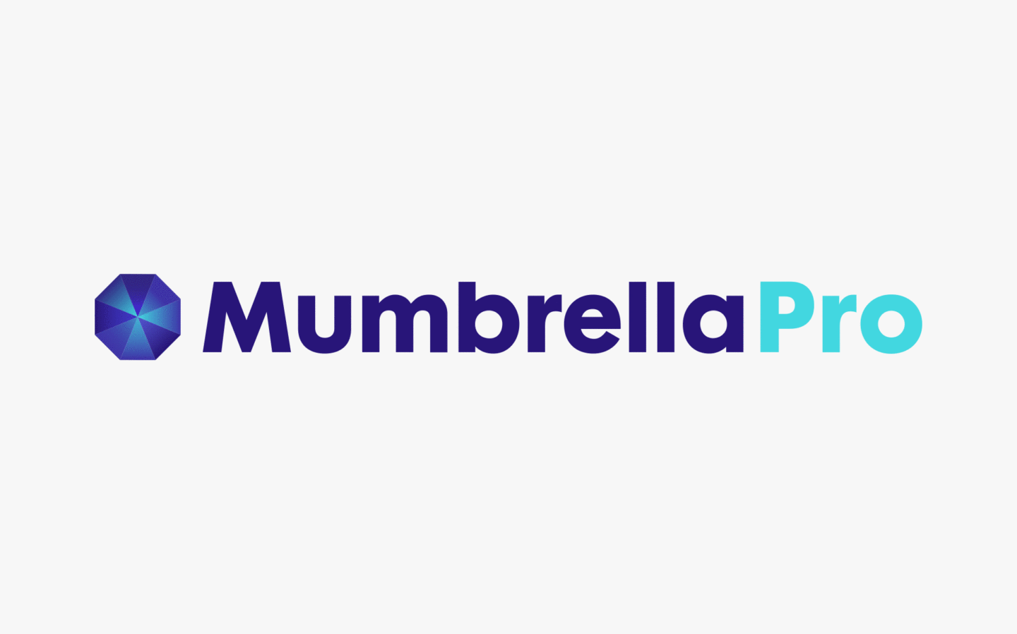
When The Code Company built the Mumbrella Pro website, we collaborated with design agency One Rise East. The aim was to leverage the recognition and equity of the Mumbrella brand, while introducing a premium look and feel that was worthy of a paywall.
By repurposing the logotype and with the addition of ‘Pro’, the identity was kept close to the parent brand. A glow was introduced within the iconic Mumbrella mark for a more futuristic feel. The addition of a royal navy gave a nod towards trust and authority.
Legibility
Another crucial consideration for publishing site design is legibility. There’s no point in having a stunning website if it’s impossible to read your content.
One of the biggest mistakes we see is text used within images, and tiny fonts. Always think about your site from a user’s perspective and consider ways to incorporate larger-text and bold elements to accommodate finger-tapping mobile users.
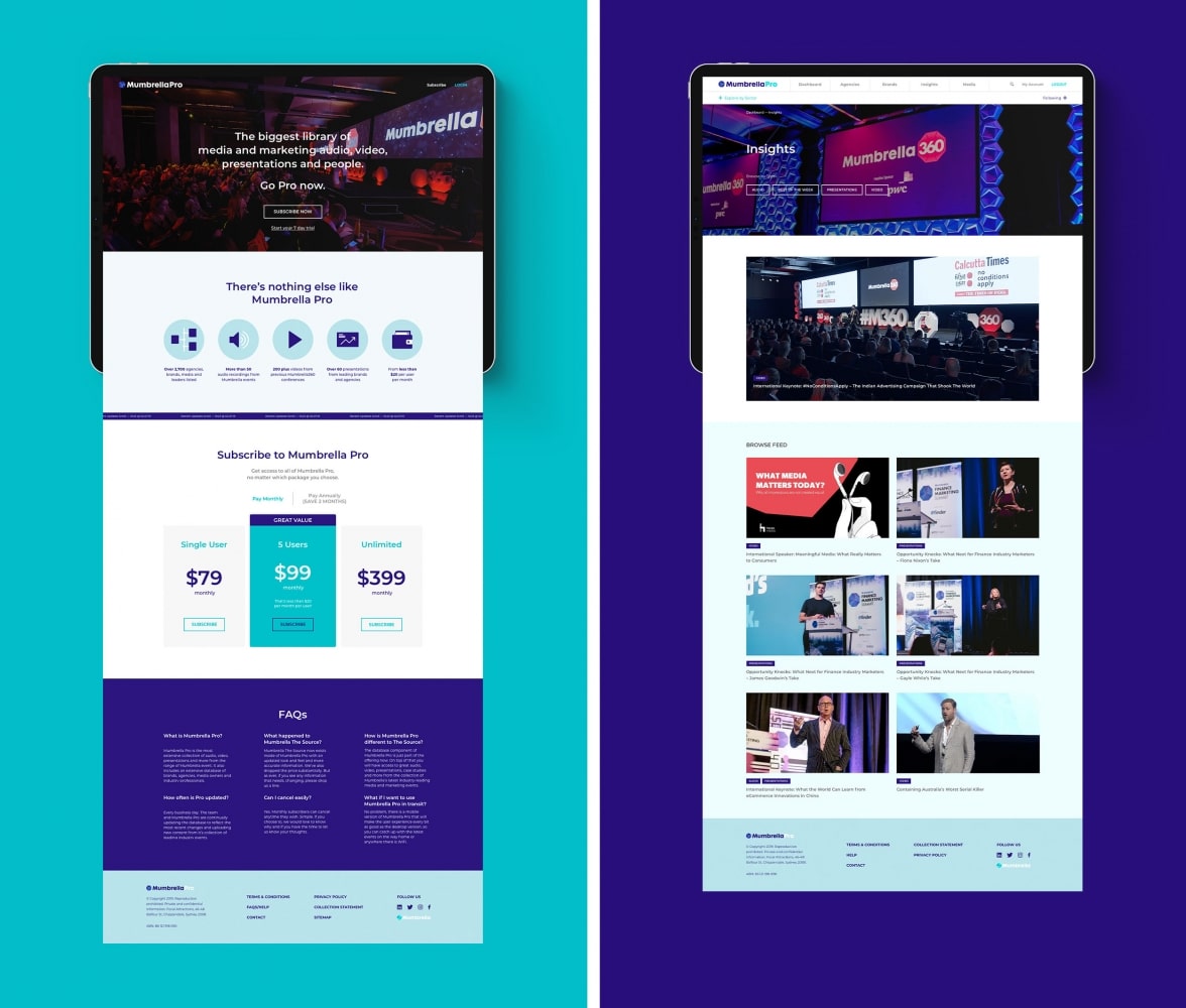
The layout of the Mumbrella Pro site is simple and functional, giving users the opportunity to browse content in a number of ways. A filtering system and clickable sector tags were added for accessibility. The colour palette was used systematically to differentiate sectors and categories. A ‘Following’ drop-down menu was designed to give users immediate access to brands, agencies, companies, and sectors of interest.
Font
What’s the best font to use for online publications? It depends on a few factors. If you have a print publication, your online font should remain consistent with that. If you’re purely a digital media operator then readability is most important, and your safest options are sans serif fonts.
But remember, there are no hard and fast rules. While adhering to the ‘science’ of branding is important, it’s important not to forget your art. Stand back, zoom out and experience all of your brand elements working together. How do they make you feel? Is this a publication you’d want to read?
The bottom line: Don’t start designing your website until you’re truly happy with your brand.
2. Be responsive
According to Similarweb’s 2020 Digital Trends, mobile traffic has increased a staggering 30% over the last 3 years. And news websites are leading the trend: Currently over 59% of news audiences are mobile. This essentially signals that if you’re publishing online, you need to have mobile in mind.
But that doesn’t mean you can forget desktop because desktop viewers still make up almost half of your audience. This presents a design challenge. A feature that looks great on a laptop might be completely illegible on smaller devices like mobiles and tablets. So with everyone looking at differently sized screens, what’s a designer to do?
This is where responsive design becomes so important. Put simply, responsive design is a way of creating a website that works on screens of all sizes. In responsive websites, design elements are automatically reformatted to optimize user experience at every touchpoint.
There are a number of factors that go into creating a responsive publishing site, which is why it’s vital to know how to choose the right technical partner. A specialist agency with publishing expertise can advise you on best practices for key components, such as pixel size for CTA buttons, margins, spacing, scalable vector graphic files (SVGs) and CSS rules.
Sound confusing? It is; that’s why it’s always best to seek specialist advice on the best responsive design for your publishing website.
3. Don’t obsess about ‘the fold’
One of the most common publishing design requests is to put everything of importance above the fold. Yet this is rarely necessary.
Firstly, mobile usage has evolved browsing behaviour and developed ‘scrolling habits’ in most readers. This behavioural change means that regardless of whether audiences they are using mobile or desktop at that time, their instinct is still to scroll down to read. So there is little point trying to cram the majority of your content in the top section of your site.
But what if you’re looking to build a subscription or membership site? Surely your call-to-action buttons need to be above the fold? Actually not. This is a myth that templated SaaS sites (see below) have propagated but bears no impact at all on conversation rates.
If your intention is to entice readers to take action, what is actually more important is your story. And a compelling story takes time to tell. That’s why in many cases, calls to action positioned below the fold perform better than their above-the-fold counterparts.
Higher conversion rates have nothing to do with whether the button is above the fold, and everything to do with whether the button is below the right amount of good copy.
Neil Patel why the fold is a myth
4. Simple designs get better results
Our entire ethos at The Code Company is to drive the best possible results in the simplest way possible. Far too often online publishers are distracted by shiny gadgets and flashing lights. When, in reality, these contribute very little to their bottom line. And in a worst case scenario, added features can even detract from what you’re trying to achieve.
With every elaborate feature that’s added to your website, you force audiences to wait a little bit longer for their content to load. And when it comes to publishing websites, time is usually money. If a site takes more than 3 seconds to load, more than 50% of readers will leave. A slow user experience is far more likely to turn audiences off than a sleek, simple and speedy site. It’s also important to remember that while video is an important component of many publishing sites it can slow your site down. So avoid third party hosted videos, like youtube and video. Instead, opt for a well-optimised video that’s uploaded to your website and displayed with html5 video tags.
Simple designs are also easier to scan (which is all a typical reader does), easier to navigate and easier to build and maintain. This means less upfront and ongoing development expense. So before you get carried away with design ideas, ask yourself if that complex animation or infographic is crucial? Or can you convey the same message in a simpler way?
It’s important not to lose sight of what’s truly important to your business and consider what is actually needed to deliver your intended results.
Keeping it simple doesn’t mean you need to disappear in a sea of sameness. The secret to successful design is to create simple uniqueness. This is one of many reasons why owning your own platform is so important for digital publishers. The templates that SaaS platforms offer might look pretty, but as Tedium’s Ernie Smith points out, you’re ‘building castles in someone else’s sandbox’.
“People are trying to build businesses on Substack and similar platforms, yet end users have no control over the coat of paint on the primary product. To me, that’s such a missed opportunity, and a red line that I will not personally cross.”
Ernie Smith – https://tedium.co/2020/09/01/creativity-the-hard-way-philosophy/
6. Forget Adobe Photoshop
Photoshop does exactly what it says on the box: It workshops photos. Yet somehow it has been appropriated as a design tool for online publishers.
Unfortunately, designs created within Photoshop rarely reflect how they will look on a live site. This can present a frustrating headache for both designers and developers. You’ll find a purpose-built digital design tool like Figma or Sketch far easier to use, and it will enable you to prototype and test your creations before they’re developed.
Once you’ve considered all of this, you’re far more likely to design a publishing website that looks great and delivers great results.
Now that’s something worth getting excited about.